Canvas绘制图片模糊问题?
在日常业务中,总能遇到使用 canvas 绘制图片的场景,今天就聊一聊 canvas 绘制图片且出现模糊不清的问题?
案例代码
<!DOCTYPE html><html lang="en">  <head>    <meta charset="UTF-8" />    <meta http-equiv="X-UA-Compatible" content="IE=edge" />    <meta name="viewport" content="width=device-width, initial-scale=1.0" />    <title>canvas</title>    <style>      .container {        display: flex;      }    </style>  </head>  <body>    <div class="container">      <div>        <p>原图:</p>        <img          style="width: 300px"          src="https://c-ssl.duitang.com/uploads/blog/202107/13/20210713121231_46508.jpeg"          alt=""        />      </div>      <div>        <p>未优化:</p>        <canvas id="canvas1" width="300"></canvas>      </div>      <div>        <p>优化后:</p>        <canvas id="canvas2" width="300"></canvas>      </div>    </div>
    <script>      function loadImage() {        return new Promise((resolve, reject) => {          const img = new Image()          img.src =            'https://c-ssl.duitang.com/uploads/blog/202107/13/20210713121231_46508.jpeg'          img.onload = () => {            resolve(img)          }
          img.onerror = (e) => {            reject(e)          }        })      }
      function drawImage(canvas, canvasCtx, img) {        const imgScale = img.width / img.height        canvas.style.width = canvas.width + 'px'        canvas.style.height = canvas.width / imgScale + 'px'        canvas.width = canvas.width        canvas.height = canvas.width / imgScale        canvasCtx.drawImage(          img,          0,          0,          img.width,          img.height,          0,          0,          canvas.width,          canvas.height,        )      }
      async function render() {        const canvas1 = document.getElementById('canvas1')        const ctx1 = canvas1.getContext('2d')        const img = await loadImage()
        drawImage(canvas1, ctx1, img)      }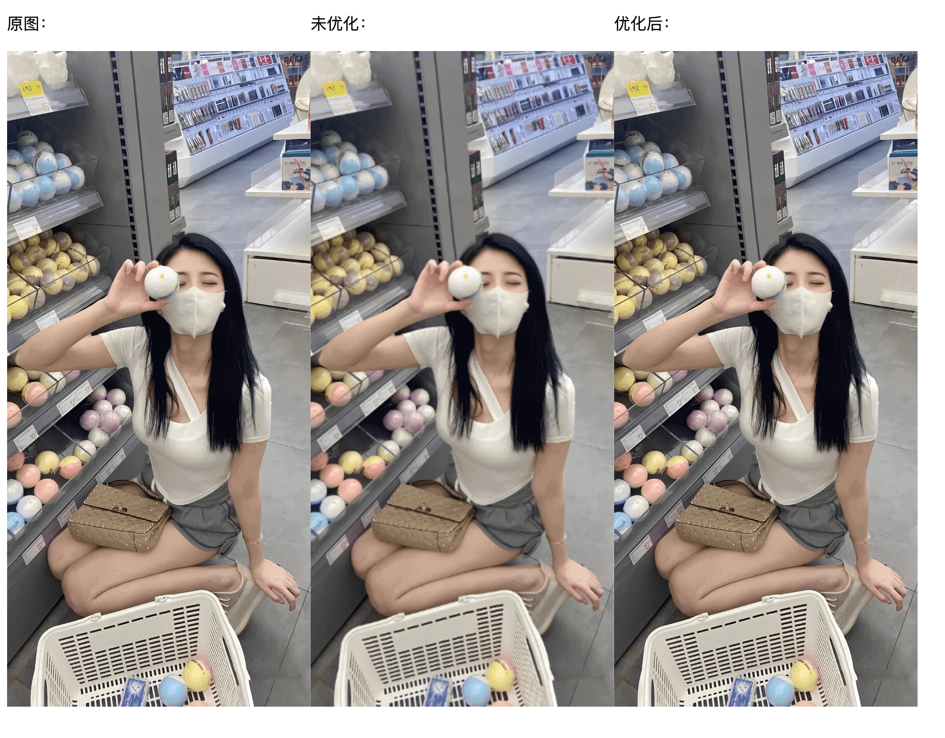
render() </script> </body></html>效果图如👇🏻
对比原图,没有优化的 canvas 绘制确实有明显清晰度下降。
🤔为什么会出现这种情况呢?
canvas 渲染出的东西本质是一张位图。高dpi显示设备意味着每平方英寸有更多的像素,如在 Retina 屏幕上相当于使用两个像素点来渲染一个像素,相当于图片被放大了一倍,因此绘制出来的东西会变得模糊。
在解决前,先了解一下像素问题,已了解可跳过。
像素问题解析
(有错误可邮件我!!!)
- 物理像素表示屏幕上有多少个发光点(颗粒),逻辑像素(也叫设备独立像素)表示屏幕展示物体的视觉尺寸是多大。
- 为什么需要逻辑像素?因为物理像素仅仅表示像素的个数,并没有规定实际的尺寸,如果说一个矩形要用10个物理像素来渲染,那么不同的(物理)像素密度和排列方式展示出来的效果也就不一样(像素密度越大图形越小);因此为了保持各设备展示一样产生了逻辑像素。
比如:某屏幕的物理像素是 375x667,那么表示该屏幕每行有375个颗粒和每列有667个颗粒组成;假设这个屏幕的逻辑像素也是 375x667,那么1个逻辑像素等于1个物理像素;假设屏幕的物理像素是 750x1334,逻辑像素依旧是 375x667,这时1个逻辑像素等于2个物理像素。这也就是屏幕的 dpr 概念,dpr = 物理像素 / 设备独立像素。
⭕ 在前端有两个很热门的问题?
- 为什么手机的设计稿大多数是2倍图?
- 为什么设置 1px 手机看起来比设计稿粗?
第一个问题:因为现在大多数手机的 dpr 都是为2,使用2倍图会在设备中显示更加精细,就好比使用一行100个物理像素的屏幕和一行50个物理像素的屏幕,同时渲染黑色到白色的渐变,明显100个物理像素的屏幕会过渡得更加自然。(记住一个物理像素只能像素一种颜色,不能说一半黑一半灰)
第二个问题:首先提一个要点,在屏幕没有缩放的情况下,1css像素等于1个逻辑像素,也就是说等于2个物理像素;(场景设计稿提供的是2倍图750x1334,设备逻辑像素375x667),设计稿中的1px相对等于1个逻辑像素,如果缩放到设备中显示,相当于每一条边进行等比缩放,所以实际需要设备中的0.5个逻辑像素显示,但你已经使用 1px(css像素),那么当然会比设计稿看起来粗。 其实这个问题个人觉得使用dpr来解析并不惬当,只是一个简单的缩放问题而已,即拿一个750px的图在375px的设备上显示,整体的设计稿缩小了,但写1px时你没去转换导致的。
解决1px问题,网上有很多,这里就不重复说了。
不少人第一时间应该会想到使用0.5px解决,确实在ios可以解决,但在android中兼容不太好。
解决思路
canvas 存在一个 backingStorePixelRatio 属性,不过现在已经废弃。转而使用在浏览器 window 对象下的 devicePixelRatio 属性,它表示浏览器的设备像素比,也就是 dpr。
举例:使用一张 100x100 像素大小的图片,去Retina 屏幕上实际会占据 200×200 像素的空间,相当于图片被放大了一倍,因此图片会变得模糊。 (图片并没有 dpr 概念,图片的参数 100x100像素,即表示 100x100像素尺寸,也表示 100x 100个像素点;Retina 屏幕 的dpr 是2,显示 100x100 像素尺寸(逻辑像素),因此需要使用 2个物理像素点去渲染 1个 像素点)
而在 canvas 中的 style.width 和 style.height 是设置画布的实际渲染大小;canvas.width 和 canvas.height 设置的是画布的大小。
当两者都设定相同数值时,在 dpr 为 1 的屏幕下是没有问题的,而在 dpr 大于 1 的屏幕下,就出现 canvas 被放大的问题;或许你把 canvas.width 比作图片像素,canvas style 比作设备像素 就比较好理解了。
所以我们可以通过 devicePixelRatio 属性来动态设置 canvas 画布大小,来实现 dpr 为 1 的时候,使用 1 倍图,dpr 为 2 时使用 2 倍图,以此类推。
🗒️ 完整代码展示
<!DOCTYPE html><html lang="en">  <head>    <meta charset="UTF-8" />    <meta http-equiv="X-UA-Compatible" content="IE=edge" />    <meta name="viewport" content="width=device-width, initial-scale=1.0" />    <title>canvas</title>    <style>      .container {        display: flex;      }    </style>  </head>  <body>    <div class="container">      <div>        <p>原图:</p>        <img          style="width: 300px"          src="https://c-ssl.duitang.com/uploads/blog/202107/13/20210713121231_46508.jpeg"          alt=""        />      </div>      <div>        <p>未优化:</p>        <canvas id="canvas1" width="300"></canvas>      </div>      <div>        <p>优化后:</p>        <canvas id="canvas2" width="300"></canvas>      </div>    </div>
    <script>      function loadImage() {        return new Promise((resolve, reject) => {          const img = new Image()          img.src =            'https://c-ssl.duitang.com/uploads/blog/202107/13/20210713121231_46508.jpeg'          img.onload = () => {            resolve(img)          }
          img.onerror = (e) => {            reject(e)          }        })      }
      function drawImage(canvas, canvasCtx, img, ratio = 1) {        const imgScale = img.width / img.height        canvasCtx.scale(ratio, ratio)        canvas.style.width = canvas.width + 'px'        canvas.style.height = canvas.width / imgScale + 'px'        canvas.width = canvas.width * ratio        canvas.height = canvas.width / imgScale        canvasCtx.drawImage(          img,          0,          0,          img.width,          img.height,          0,          0,          canvas.width,          canvas.height,        )      }
      async function render() {        const pxRatio = window.devicePixelRatio || 1
        const canvas1 = document.getElementById('canvas1')        const ctx1 = canvas1.getContext('2d')        const canvas2 = document.getElementById('canvas2')        const ctx2 = canvas2.getContext('2d')        const img = await loadImage()
        drawImage(canvas1, ctx1, img, 1)        drawImage(canvas2, ctx2, img, pxRatio)      }
      render()    </script>  </body></html>